Of coolly calculated Art
Of coolly calculated Artby Annette Galinski | 04.11.2011
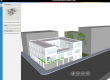
St. Gallen city lounge
The city of St. Gallen in Switzerland literally rolls out the red carpet for displaying modern art upon for its visitors.Switzerland has a good reputation abroad, despite the clichés about the wealth of neutrality, discretion, Swiss cheese or other golden reserves. Last, but not least this reputation has been backed up by a study carried through by the Hochschulinstitut für öffentliche Verwaltung (IDHEAP) (college institute of public administration). However, the fact that the Swiss are capable of more than being able to keep things to themselves has been given proof of by the Raiffeisenbank through re-designing the Bleicheli Quarter in St. Gallen. ”The architecture is a supporting pillar of Raiffeisen’s corporate identity“, says Martin Kaiser in 2005, Raiffeisenbank’s principal’s consultant. The same year, the Raiffeisen superstructure has taken over a major part of the Bleicheli Quarter. The logic result was to create a connective element of the building through cultivating the free areas.
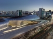
The work group gathered around the artist Pipilotti Rist and Carlos Martínez Architekten had won the competition. And their idea of a “city lounge” has nothing to do with any clichés of neutrality, which is particularly true of the coloring. The work group covered the whole city quarter’s outdoor areas with a flashy red floor coating made of rubber granulate. Some of you may know this material, tartan, from sports classes at school, the tracks on which pupils race against each other.
A red Sea at an Altitude of 675 Meters
In the Bleicheli Quarter, Pipilotti Rist and Carlos Martínez Architekten covered benches, tables and roads of various shapes and styles under a flood of color. Even a Porsche car Rist and Martínez made disappear under a rubber granulate layer. Nonetheless, the artist and the architect tamed the masses of tartan in a way that, instead of overwhelming the viewer, they gently snuggle against the shapes. Each single edge and curve of seats and each clearance of the car are clearly visible. The material heats up in the sun to a nice temperature and, in case of cool weather, it does not cool down to the extent as wood or metal benches would do. Tartan seems to be immune against water.
The various patterns the seats have divide the quarter into individual topics such as “Café“, ”Relax Lounge“ or ”Business Lounge“. The light design completes the outdoor living room. Bubbles of three meters in diameter float above the area. Colorful and white fluorescing lights bathe the quarter in a subdued light, halogen metal vapor lamps allow to switch to a passage illumination through the press of a button.
Interplay between gentle and sterile
The newly designed Bleicheli Quarter has a futuristic look and also displays gentle waves. The artist Pipilotti Rist had realized this formal language already in her previous works, which mainly show woman’s nature. Pipilotti Rist became well-known through video installations and experimental movies. The artist likes letting shapes and colors flow into each other and rounds things off through acoustic and haptic effects. Her works can be found all over the world as exhibits of the most important collections of contemporary art such as at the Museum of Modern Art in New York.
A contrast to Pipilotti Rist’s flowing shapes are the clear, almost sterile looking designs by Carlos Martínez Architekten. The firms received international acceptance in 1992 for their design of “Sparta”, in which Martinez had managed to achieve largest possible result in terms of living space on a smallest possible area. Looked at as their own, his buildings appear pragmatic and clearly structured.
The interplay of Martínez’ purism and Rist’s love of adventure create amorphous shapes within the Bleicheli Quarter, looking as if they had grown into the surrounding glass and steel façades. Within this symbiosis, the difference between inside and outside can be exchanged arbitrarily. The choice of color and material within the Bleicheli Quarter has the positive side effect that drivers making their way through the Lounge quarter act more carefully and focus more on what’s going on around them as well as on pedestrians.
Art and Transience
As nice and shiny art may be, and, without any doubt, architecture belongs into this category, it follows trends. The transience of tartan is still present to most people from sports classes at school. The material cannot keep its deep red color for good. The advantage of weather resistance may turn into a disadvantage for the red carpet in St Gallen. The large pores of the surface, impermeable to water, makes tartan an ideal nutrient medium for moss. The result: The material looks, after almost six years, like rust. German magazine “Garten + Landschaft”, dealing with landscape architecture, had articles about the current condition of the former red miracle in its 2010 October issue.
To youngsters, the tartan coating, which can be almost seen in a positive way, appears as the more reasonable alternative to their living room at home. Spilt drinks have less negative effects on tartan than on parquet floors and laminate. What was once designed as an over-sized open-air living room does not only make people living here sleep less, but their nerves are all on edge, too. St Gallen newspapers write about parties until late at night and problems with litter. In a radio feature, Swiss radio station DRS once called the Bleicheli Quarter a “place to be avoided”, and local innkeepers are suffering from having less customers. No doubt, Raiffeisenbank made an effort in bringing the various parts of the quarter together, in supporting art. It’s a shame that when it came to re-designing the Bleicheli Quarter, Raiffeisenbank took a neutral position towards any Swiss cliché and followed a trend of its own.


Comments
It's red. Fantastic!
I like your buildings although I prefer to learn to read this great article with regards to tourism as a possible document having a identify Wisata Pulau Tidung
I really like the buildings nevertheless I prefer to read the article about vacation as a possible write-up which has a concept Wisata Pulau Tidung
Must feel great walking around inside that, but won’t the ever present red get oppressive after some time? Blue is what I would have chosen, but admittedly that wouldn’t have looked so good as this. Great work, and a great post. non reflective glass